
PlanAR is an app that will work as a visually appealing one-stop itinerary for efficient traveling and planning that's made with Unity. This AR mobile application creates a digital experience by helping you plan your trip in an easier and more immersive way. The focus of the app is to help showcase places in AR to market businesses, encourage people to travel and build anticipation for travel plans after the pandemic.

Toronto Tourism
The tourism sector in Toronto was the first to be hit by the pandemic and is expected to be the last one to recover. It’s expected to lose billions of dollars in direct and indirect spending in 2020 alone. In order for the industry to fully recover, businesses and tourists alike will need to feel safe. It is the first time that the federal government is supporting marketing campaigns that are linked to the fact of travelling locally to help get the tourism industry in Toronto back on its feet. There is a need for convincing people in the Toronto, GTA, southern Ontario area to visit Toronto on a staycation.
Travel Planning
According to the study, the majority of travels around the world were Millennials travelling for pleasure. They average 80% of the statistic. The reason behind this is that Millennials see a vacation as a unique experience that they need to take control of. A Deloitte study found that 59% of global travellers use the Internet when planning instead of using travel agents. 68% of which are Millennials that are planning using mobile technologies than asking travel agencies.


HELP
make travel planning easier & more immersive
CREATE
anticipation around traveling
CONNECT
people through this app during the pandemic
We conducted a survey to better understand our users and their behaviours towards itinerary planning. The results of the survey helped us design solutions for our AR mobile application based on their needs (data-driven design).

These personas are the representation of our key audiences.

Sarah is a soon-to-be city connoisseur that is spontaneous and a thrill seeker who is always looking for her next adventure. She likes to find hidden gems and likes to know the ins and out of each city.
This is a journey map of Sarah spontaneously going on a trip because of boredom and thrill seeking, and how PlanAR intends to solve her core needs


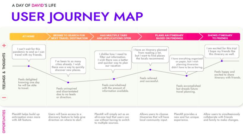
This is the David the tourist. He is a calculated individual that likes to plan both future and imaginary trips on his spare time with his friends and family.
This is a journey map of David going through one of his planning processes (future planning because of the pandemic), and how PlanAR intends to build anticipation with its AR feature and how it will solve his core needs.
Visualizing the user journey of the AR experience.

Flowchart to display the path an user takes while completing a task.

While making the wireframes using InVision the aim was to make the AR application more immersive and engaging.


It took about a week to finalize the logo, we wanted to come up with something that conveys playful energy and vibrance.


Jost is a functional typeface that comes in a variety of different weights. This makes it possible to use the same font in different circumstances. Jost is a simple chic font that is modern looking and aligns with the personality of our brand.
Jost is a functional typeface that comes in a variety of different weights. This makes it possible to use the same font in different circumstances. Jost is a simple chic font that is modern looking and aligns with the personality of our brand.

Our brand mostly targets the younger audience and so intends to display a youthful and playful personality with its colour. The split complimentary colour scheme conveys energy and vibrance.


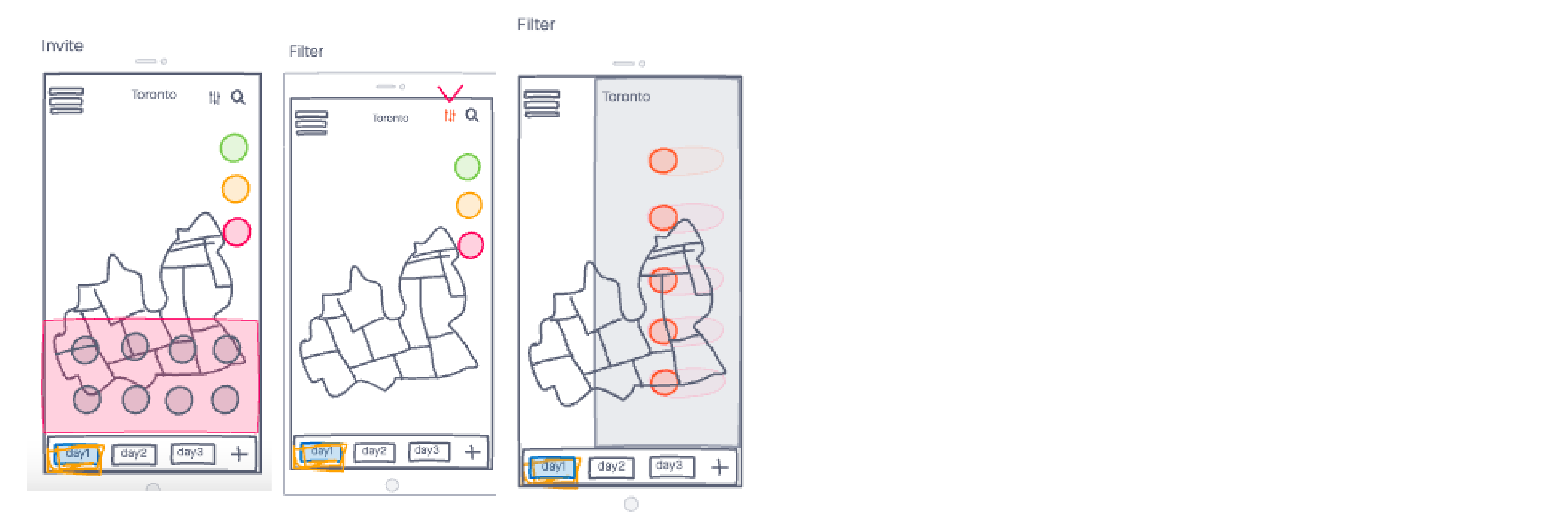
- Get all your travel itinerary in one place
- Search for places easily to add to the mood board
- Filter out the places to narrow down your options
- Easily pick places from the nearby suggestions
- Invite friends to edit travel itinerary together
- Option to select a day and edit the mood board accordingly

- Scan the floor
- Place the mood board
- Drop 3D models to create your itinerary
- Get info about the place you pinned
- Scan the floor
- Place the mood board
- Drop 3D models to create your itinerary
- Get info about the place you pinned

- Pre-made itineraries
- Each day is packed with fun activities
- Choose the desired location from the options to add to the mood board
Check out the prototype!


